Impact
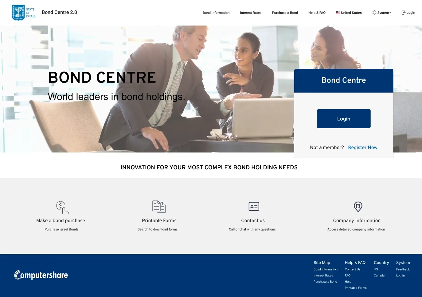
Redesigned a cluttered bond portal for bondholders and admins and shipped it to production. The split navigation won in A/B testing, and multi-step tasks became guided 3-step wizards.
| My role | Sole UX/UI designer, audit → dev-ready designs |
| Team | Product owners, project managers, developers |
| Users | Bondholders and admins |
| Platforms | Desktop + responsive mobile |
| Tools | Figma |
The problem
Bond Centre is where State of Israel Bond owners check their portfolio, update details and submit forms. The old app was clunky and hard to use:
- Cognitive overload: too much data on one screen
- Confusing navigation: one long menu mixing everyday tasks with account settings
- Weak admin controls: no clear way to approve or reject submissions
Two users, two jobs
| Bondholders | Admins |
|---|---|
| See their bonds and value | Review submitted forms |
| Download statements and tax forms | Approve or reject requests |
| Update banking, address and preferences | Keep bondholders informed |
Every flow had two sides: what the bondholder does, and what the admin sees next.
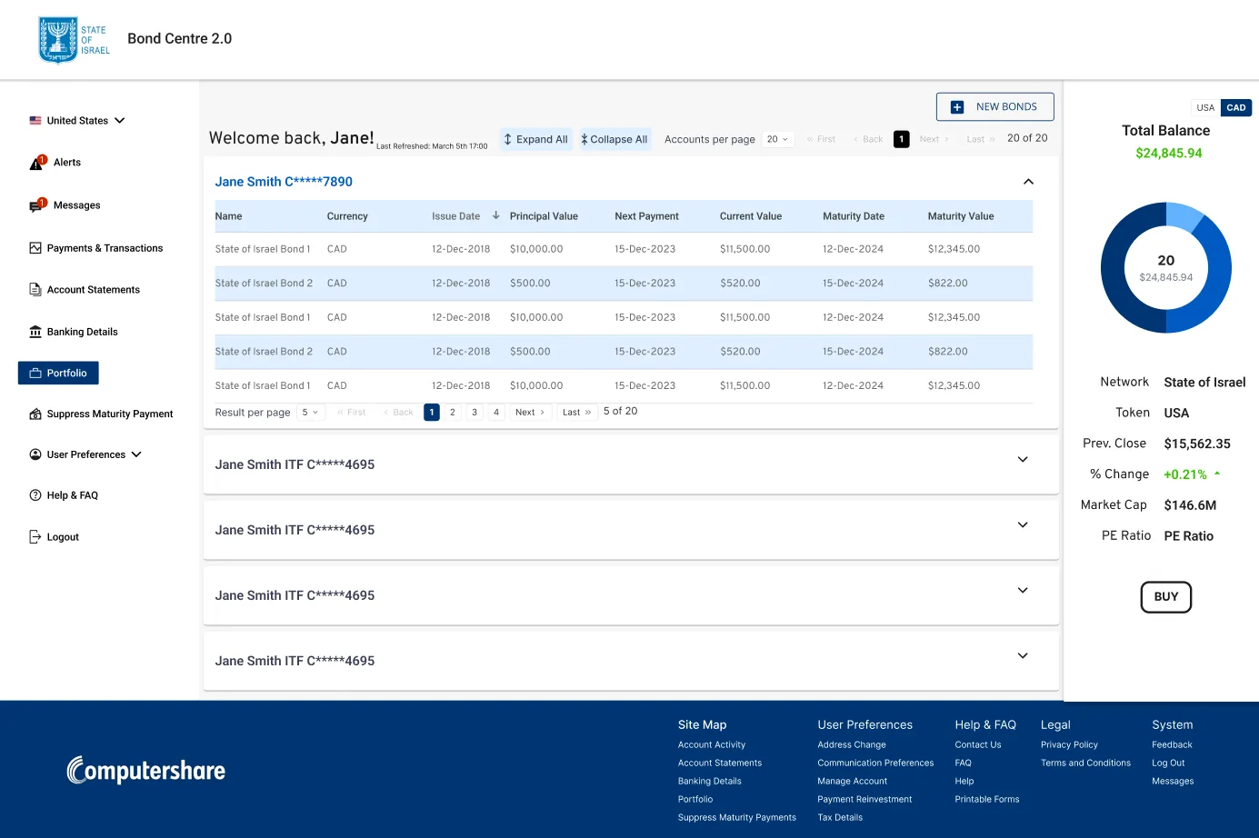
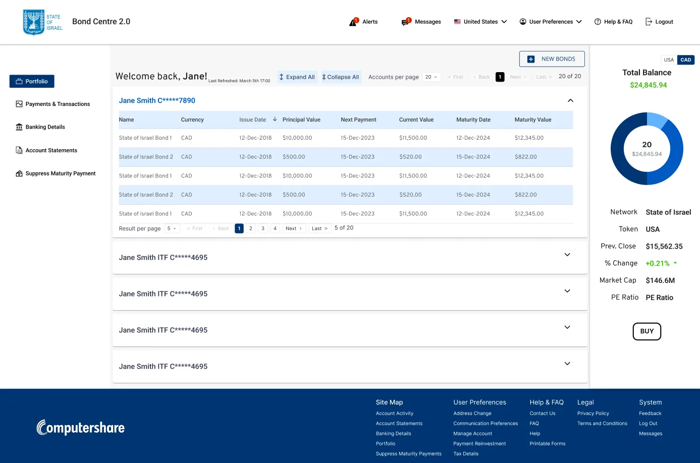
1. Navigation: separating doing from managing
I tested one long left menu against a split navigation:
- Left: tasks (Portfolio, Payments & Transactions, Banking Details, Statements, Suppress Maturity Payment)
- Top right: account items (Alerts, Messages, Preferences, Help, Logout)
The split navigation won. The single menu felt busy; the split follows a pattern people know from everyday apps.
2. Taming the data: accordions + pagination
Some bondholders hold many bonds across many accounts, so:
- Each account is an accordion, with Expand all / Collapse all
- Bonds sit in a short, paginated table, and users choose how many rows to see
- A summary panel shows the total balance, with a USD / CAD toggle
The bondholder decides how much is on screen, not the system.
3. Wizards for multi-step tasks
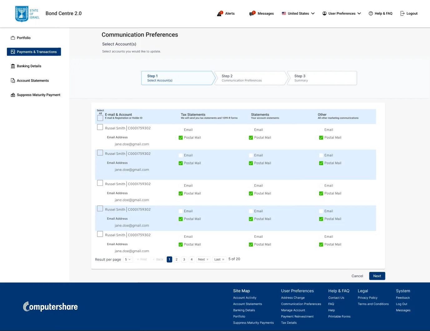
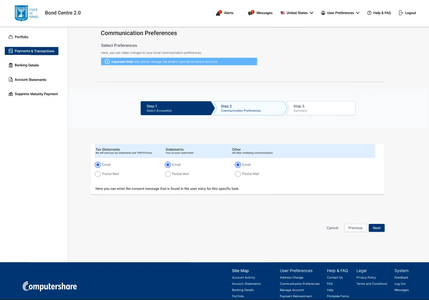
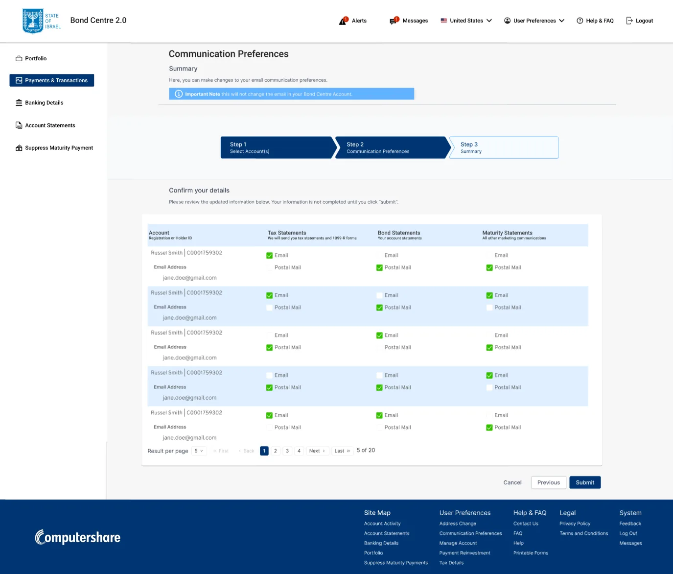
Updating communication preferences across accounts used to be one dense form. I turned it into a 3-step wizard with a stepper and a back button:
- Select accounts, with select-all
- Choose preferences: email or postal mail for each statement type
- Review and submit
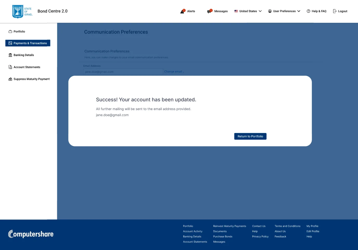
…then a clear success confirmation.
4. Forms and uploads without losing your place
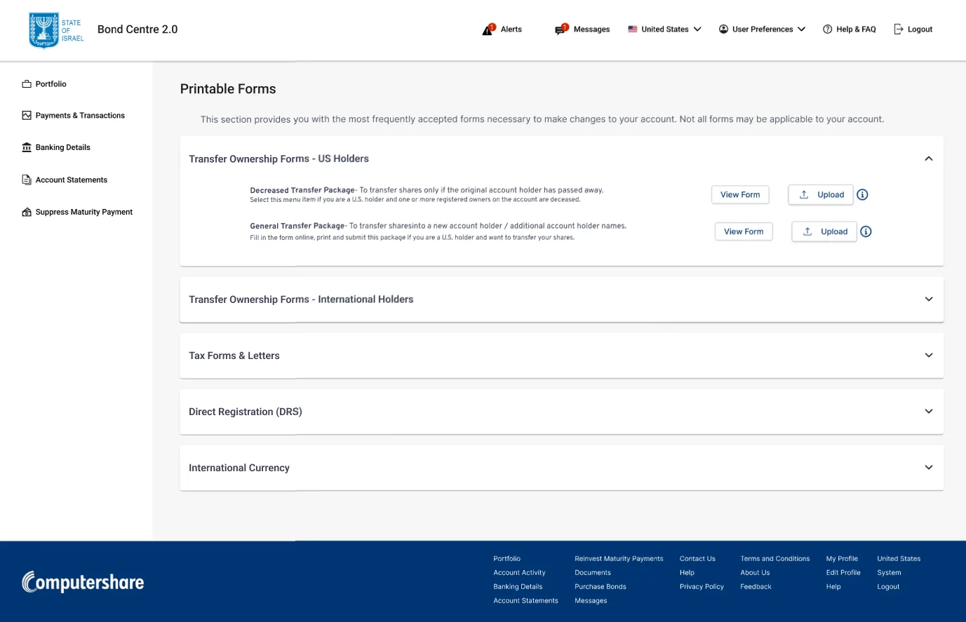
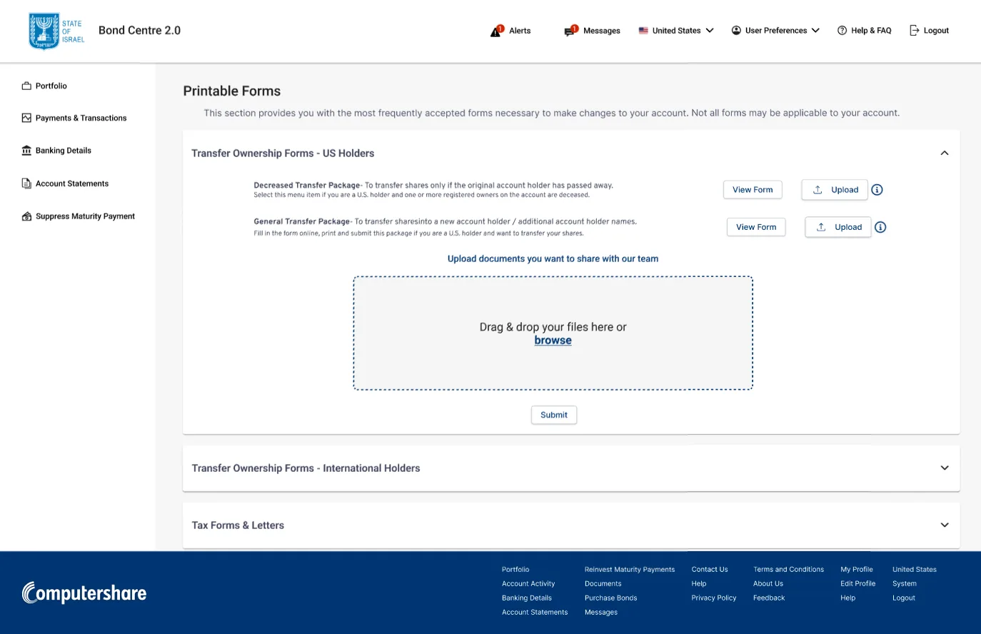
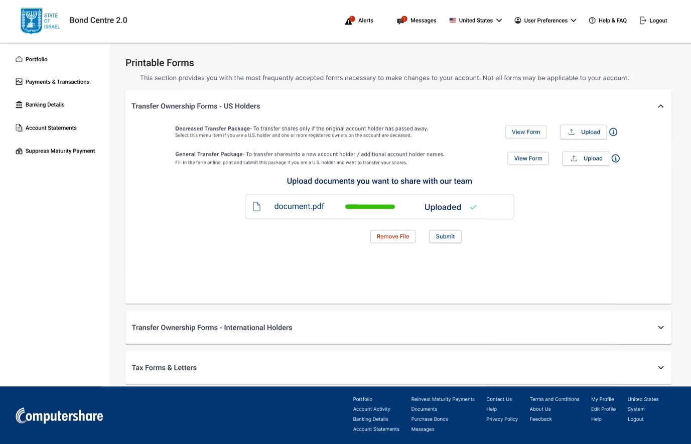
Printable forms sit in five accordions (US, international, tax, direct registration and international currency). Bondholders upload the signed copy right inside the section: drag and drop, a progress bar, an "Uploaded ✓" state and Remove file.
5. Admin controls that close the loop
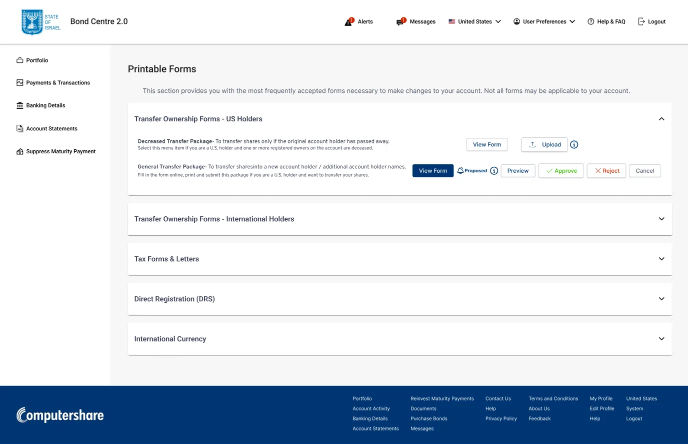
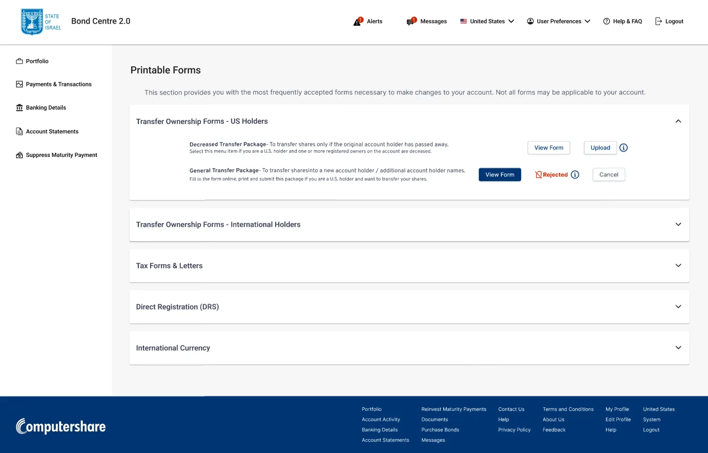
Admins see each submission marked Proposed, with Preview, Approve, Reject and Cancel. Bondholders see the result (for example, Rejected) right next to their form, with an info icon explaining why.
6. Designed for every screen
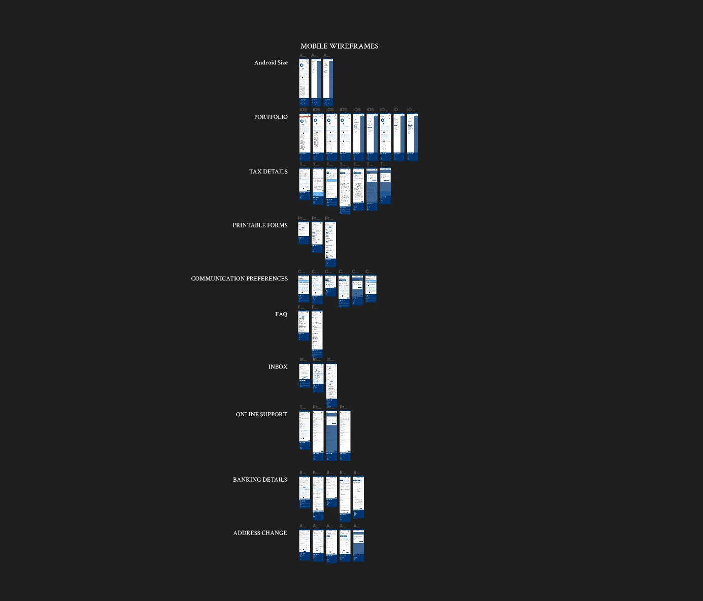
I designed every screen for desktop and mobile (iOS and Android sizes).
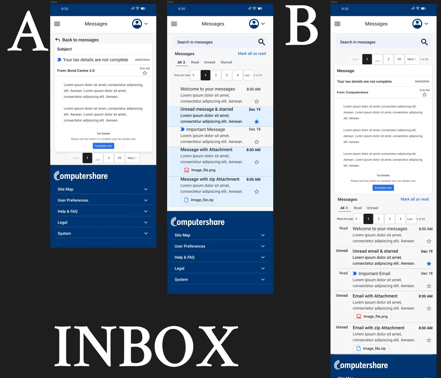
For the mobile Inbox, I compared separate list and message screens (A) against the message stacked above the list (B). A won, because it works like the email apps people already use.
Outcome
Product owners and developers were excited about the upgrade: calmer for bondholders, with real controls for admins.
A company-wide layoff shortly after launch meant I couldn't collect usage data.
What I learned
- Research turns unknowns into solutions. Proven patterns led me to the accordions and wizards that solved the clutter.
- Component libraries raise the bar. Figma libraries got me to a polished, consistent look fast.
- Familiar patterns win. Both A/B tests went to the layout people already know from everyday apps and email.
- Next time: a real handoff. Specs, states and interaction notes, so developers don't have to guess.