

Project Insight | Analytical Dashboard
I empowered investors through rigorous testing of 3 fidelities of dashboard prototypes, low, medium, and high, evaluating pivotal data points, assessing headline significance, trending insights, disaster map relevance, and loan search functionality in remote sessions recorded for meticulous data analysis.

Introduction
Embark on a transformative journey through my dashboard design case study, where I showcase my expertise in crafting intuitive and visually compelling interfaces. In this exploration, I delve into the meticulous process of developing user journey maps, creating interactive prototypes, and conducting A/B testing to optimize user engagement and conversions.
Join me as I leverage data analysis techniques, user interviews, and usability testing to inform design decisions, ensuring a seamless blend of user-centricity and data-driven precision. This case study not only highlights my proficiency in assumption mapping and comprehensive UX research but also underscores my collaborative approach with cross-functional teams in agile environments. Immerse yourself in the realm of effective dashboard and data visualization design, where complexity meets user-friendly elegance to deliver impactful digital solutions.
Design Process
01 Research
02 Sketching & Storyboarding
03 Assumption Mapping
04 Mood boards & Resources
05 Wireframing
06 Flow Charting
07 User Journeys
08 Prototyping & Testing
09 Next Steps & PowerBI
10 Project Screenshots

Research
As I began my journey to find out morea bout the user, I was provided a list of Jobs to be Done from our product manager. I was able to iodentify Corey Watts, our executive with needs and frustrations relevant to said jobs.
I hosted User Interviews with our clients in order to discover more.
-
What is your current role?
What does your work day look like?
How do you feel about the current investor portal?
What are some common tasks you must do on this platform; can you walk me through it?
What actions do you take after visiting the investor portal?
Is there anything you can't accomplish now that you want to?
Do you think this software is helpful?
Is it easy to accomplish your goal?
what are some of the best aspects of it?
What are some of the worst aspects of it?
If you had to replace our current product, where would you go and why?
How might we statement
How might we provide an analytical dashboard design by seamlessly integrating data-driven insights and user-centric principles?
This case study delves into the development of user journey maps, interactive prototypes, and A/B testing to reimagine the user experience. Through data analysis, user interviews, and usability testing, I iterate designs, aiming to deliver visually appealing and intuitively designed dashboards. Join me on this journey of transformative UX, exploring collaborative efforts in assumption mapping, comprehensive research, and agile environments.
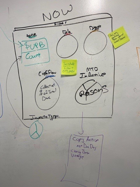
Storyboarding & Sketching


Assumption Mapping
Assumption maps serve as invaluable compasses in the landscape of user-centered design, guiding the journey towards a deeper understanding of user needs. By systematically laying out our assumptions, these maps not only illuminate potential blind spots but also set the stage for targeted and effective user need discovery. As dynamic tools, assumption maps empower designers to navigate uncertainty, prioritize investigations, and ultimately unveil insights that inform user-centric solutions. In this process, assumptions transform from potential pitfalls into stepping stones, fostering a more comprehensive and informed approach to UX design.


Mood-board & Resources


Wireframing
Low fidelity wire-frames were created to show the placement of logos, buttons, and navigation.

Flow Charts
The evolution of flowcharts has undergone refinement, emphasizing the pivotal role of navigation as the focal point within dashboards. This strategic adjustment is designed to ensure a seamless and intuitive navigation experience, placing a pronounced emphasis on the intricate dynamics between client interactions and metric exploration.
Refinement Flow Chart

In the medium-fidelity iteration flowchart, a deliberate choice was made to adopt a simplistic approach to dashboard design. This approach aimed to distill the essence of the dashboard's functionality. Contrastingly, this high-fidelity refined version takes a more nuanced stance. It accentuates the inceptional navigation, introducing a deliberate progression from one graph to another, thereby facilitating a meticulous drill-down approach. This elevated iteration seeks to optimize user engagement by offering a sophisticated and layered exploration of metrics within the dashboard framework.

User Journeys
User journeys witnessed refinement to understanding the persona at a deeper level. This strategic adjustment ensures fluid navigation, prominently featuring the engagement dynamics between investor and the dashboard.

Navigation
The initial implementation of our dashboard featured a primary navigation structure with specified line items marked the genesis of our user interface journey. However, a transformative juncture materialized during testing, leading to the inception of Prototype B. This evolution was catalyzed by the recognition of a profound need for diverse dashboard types. This pivotal moment not only responded to user demands but also unfurled a portal to a realm of new dashboards enriched with extensive insights. The integration of these diverse dashboards not only amplified the capabilities of our platform but also unveiled hitherto untapped potentials, marking a significant leap forward in enhancing the overall user experience.

Prototypes A/B/C

-
The exploration of navigation paradigms within Prototypes A, B, and C represents a meticulous inquiry into user experience dynamics.
Prototype A showcased a conventional top-positioned primary navigation, encompassing pivotal elements like the main dashboard, trending insights, disaster map, loan search feature, and user profile pages.
Prototype B extended this schema by introducing a secondary navigation, offering toggling functionality across eight distinct dashboard types.
Prototype C, while maintaining the aforementioned navigations, introduced a spatial shift, situating the primary navigation along the left-hand side vertical column.
-
This investigation underwent rigorous user testing, encompassing a diverse user base. Remarkably, the outcomes yielded a surprising lack of definitive user preference regarding the placement of the primary navigation—whether atop or on the left.
However, a revelation of paramount significance surfaced during the scrutiny of the secondary group tabs navigation. This component emerged as pivotal, wielding an indispensable influence in elevating the overall navigation experience for users. These nuanced findings underscore the intricate nature of user preferences and emphasize the pivotal role of secondary navigation components in shaping an optimal user interface.
This nuanced discovery not only informs the design choices but also underscores the significance of meticulous user testing in refining the UX. This experience reaffirms the importance of considering each component's impact on the overall user journey, even when seemingly subtle elements can significantly contribute to an enriched user experience.
Interaction Design for Analytical Dashboards
In my role designing analytical dashboards, interaction design played a pivotal role in shaping the user experience. I focused on creating intuitive, user-centered interfaces that streamline complex data interactions. By employing a user-centered design approach, I crafted dynamic dashboards that not only present data effectively but also enhance user engagement and decision-making.
Through this iterative design process, I enhanced the dashboard’s usability and impact, making complex data more accessible and actionable for users. This approach aligns with my emphasis on creating high-impact, user-focused designs that drive product excellence and improve overall user satisfaction.
Key to this process was collaborating with stakeholders to define clear user needs and business objectives. I used Figma to design interactive prototypes, ensuring that each element— from data visualizations to map navigation—provided a seamless and engaging experience. Rigorous usability testing allowed me to refine these designs based on user feedback, ensuring that the final product was functional and user-friendly.
Web Accessibility and Responsive Design for Analytical Dashboards
WCAG 2.2
Conclusion
Ensuring web accessibility was a core focus in the design of the analytical dashboards. I adhered to WCAG guidelines to create an inclusive experience for all users. A key element of this was the use of contrasting colors to enhance readability while maintaining brand consistency and design system integrity. By carefully selecting color schemes that meet WCAG contrast standards, I ensured that text and visual elements were distinguishable for users with visual impairments.
Responsive Design
Additionally, I implemented scalable typography and responsive design principles to ensure the dashboard was accessible across various devices and screen sizes. This involved designing flexible layouts that adapt seamlessly from desktops to mobile devices, guaranteeing a consistent and functional user experience regardless of the platform.
Other accessibility measures included:
Keyboard Navigation: Ensuring all interactive elements are accessible via keyboard for users who rely on assistive technology.
Screen Reader Compatibility: Using ARIA (Accessible Rich Internet Applications) labels and roles to enhance the screen reader experience.
Consistent Navigation: Providing clear and consistent navigation to help users understand their location within the dashboard and easily move between sections.
Accessible Forms and Inputs: Designing forms and input fields with clear labels, error messages, and instructions to support users with cognitive and motor impairments.
Accessibility
By prioritizing web accessibility and responsive design, the analytical dashboards not only comply with industry standards but also deliver a superior user experience that aligns with my commitment to inclusivity and usability.


Next Steps

In my next steps, I'm exploring Power BI to elevate my dashboard's data visualization. Learning Power BI is crucial as it enhances my ability to bring complex data to life in an interactive and dynamic manner. The platform's versatility and integration capabilities empower me to create user-friendly dashboards that go beyond aesthetics, offering meaningful insights. Mastering Power BI not only expands my skill set but positions me as a designer capable of delivering sophisticated, data-driven solutions that enhance the overall user experience.