

Instacart Recipe Finder
In an attempt to solve multiple solutions, I incorporated a recipe-finder and other toggle features that allow the user to communicate more effectively with the application.
Opportunity Statement
Instacart allows the user to order groceries for home delivery through the store of their choice, with limited inclusivity.
It fails to provide an efficient means of navigation to locate items for users with dietary restrictions (Vegan, GF, Kosher, etc.) or cultural dietary preferences (Goya, Sabritas, Jose Ole) products for the Latinx consumer.
It lacks the option to shop from multiple stores at once, which would help when trying to locate those imported items that aren't always available in your average grocery store.

The UI design was geared towards aiming to maximize efficiency and memorability with the implementation of a recipes page including a quick recipe finder, and adding several toggle features when choosing your stores and dietary preferences.
The idea aims to solve the issue where people with dietary restrictions or cultural dietary preferences to help find their items more efficiently and improve overall user satisfaction.
Research & Assumptions Summary
I did research on Page Flows, Medium, and The UX Collective. This helped me understand the user journey better and how to translate the flow into a wireframe, then to a working prototype.
Assumptions entering the study:
The user will not be able to efficiently locate vegan food items.
The user will have to navigate several pages before finding food that meets their dietary requirements.
There are not enough filters in place to help assist the user in finding their specific items.
Ideation

ITEM DESCRIPTION (Figure A)
For the items page, I wanted to denote the dietary preferences of each individual item, as well as provide a channel that would give more insight on the item flavor, freshness, and value for money.

RECIPE FINDER (Figure B)
I implemented a “Recipe Finder” to help the user find their items according to what dish they may want to cook that week. I quickly sketched how I wanted that to work, and categorized the recipes by breakfast, appetizer, dinner, etc.
Wireframing

Wireframe made on Adobe XD
I created low level wireframes on Adobe XD to determine the initial layout of the prototype, later translating them into a high fidelity prototype with Figma.
I used royalty free images for my content images, and used the Figma Ever Icons to use visual representation of the navigation menu. I enjoyed using Adobe XD but I feel like Figma is a little more user friendly.
Ideation Continued

FIGURE A
Your Likings
As far as the dietary preferences go, I added the same toggle feature that was implemented in the store selection page, which would allow the user to provide more insight to get better results matched by the application.

FIGURE B
Store Select
I implemented a toggle feature in the “Choose your stores” page so the user would be able to see and shop for items from different stores in the same grocery delivery/order.

FIGURE C
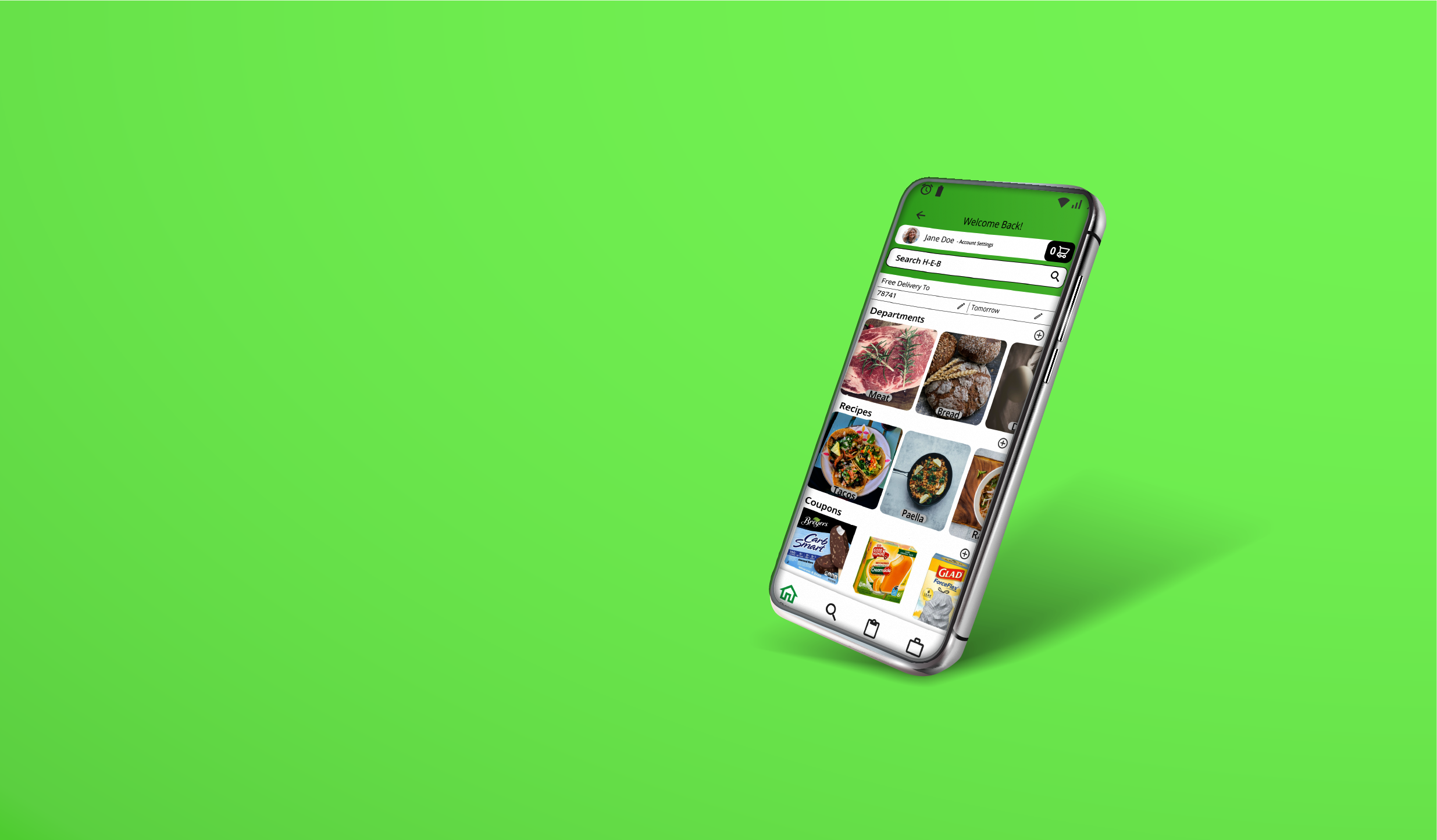
Departments
Used a refined selection of departments, then chose the selection of the most common dietary restrictions and listed them to get a better idea of what kind of icons I would need to look for.
Concept Prototype

User Flows
Whimsical was used to create the initial user flows. Adobe XD was used to create the wireframes. Figma was the last tool that was used for the final prototype.
User Flow: https://whimsical.com/XKLZYKT9DXcM1zDx2hPQfB
Testing the concept prototype allowed me to see that I was overloading the user with information even though I thought I was already keeping things simple.
Usability Prototype

A Prototype is effective prior to launching your app. This will allow for usability testing to ensure that we are taking note of important data to consider when designing the next phases of the project.
Future States

I want to add a video clip or AD for the related item, to entice the user further if they're having doubts about a certain item.
Additionally, I wanted to add features and details such as where the item is from (i.e. tomato, produce, “Mexico” or “Canada” and “Days to emerge- 5-10”).
On my recipes page, I would like to implement a toggle where the user could make their items meatless. (i.e. They're looking for a Mexican Dish like tacos. There would be a simple toggle that would modify the recipe accordingly).
Reflection
Design Development
Through the design development of this project I learned new design methods in two different programs as well as time management. I started writing more things down
During this project, I didn't expect to struggle as much as I did with the user journey flows. I tend to do my journey, but not actually follow the journey when I’m creating the UI, so I got lost many times trying to find the missing links within my UI design flow. I understand how to design the prototypes but I do need more practice with doing User Interviews and User Flows.