

Game Studio
Any game, any time, anywhere, and all from your smartphone.
Background
We are testing an app prototype that hosts games, that can be streamed, and played online with friends. We are primarily assuring layout, color, and that its general functionality is logical and streamlined, while also being aesthetically pleasing.
There are many gaming consoles and PC services out there that allow for online multiplayer gaming, but there's no channel that allows you to play, join a local or online party, and stream to your audience all at the same time.

We want to create a cloud gaming, streaming, multiplayer mobile platform. Our competitors are Steam, Xbox Cloud Gaming, PlayStation, and Twitch.
Group Case Study: Tami Trevino & Shelby Combs
Problem Statement
How might we provide gamers with the most immersive and cooperative platform to play games with their friends, on the go?
User Research Methodologies
01 Personas
02 User Journeys
03 Scenarios
04 Individual Interviews
05 A/B Testing
Ideation

Persona 1
Hector Thomas is a 32-year-old dentist who is an expert in technology. He prefers Microsoft products when gaming, such as Xbox over PlayStation.
On the other hand, he prefers apple devices for his desktop and mobile devices. He wants a simple UI with the fastest streaming experience anyone has to offer.

Persona 2
Alexandra Athenas is a 24-year-old twitch streamer. She is very involved in the digital world and loves girly games that provide an immersive experience.
She likes to have a simple gaming experience with simple UI that is memorable and allows her to win continuously.

Persona 3
Markus Eli is a 17-year-old college student. He is experienced with gaming and has multiple consoles from the Nintendo switch to the PS4. He does prefer PC gaming on his Windows Desktop computer that he built himself.
His priorities include better graphics, faster streaming service, and many in-game customizations with little to no loading time.
Flow Charts
We created flow charts representing a path we assumed each proto-persona would take when using our app to reach their goal.

Design System

We developed a design system for the app in order to execute a brand that people would find visually appealing and would want to return to with ease of use, memorability, and accessibility.

Typography
We found 2 Sans Serif fonts that were clean, minimalist, and easy to read from any size.
Poppins
Lexend Deca
Wireframing

We began with a web design for the low-fi wireframes trying to design a browser-based platform for our users.
After doing further research, we determined that doing a mobile design would have a more successful download and daily open rate given the data that was collected about mobile gaming.
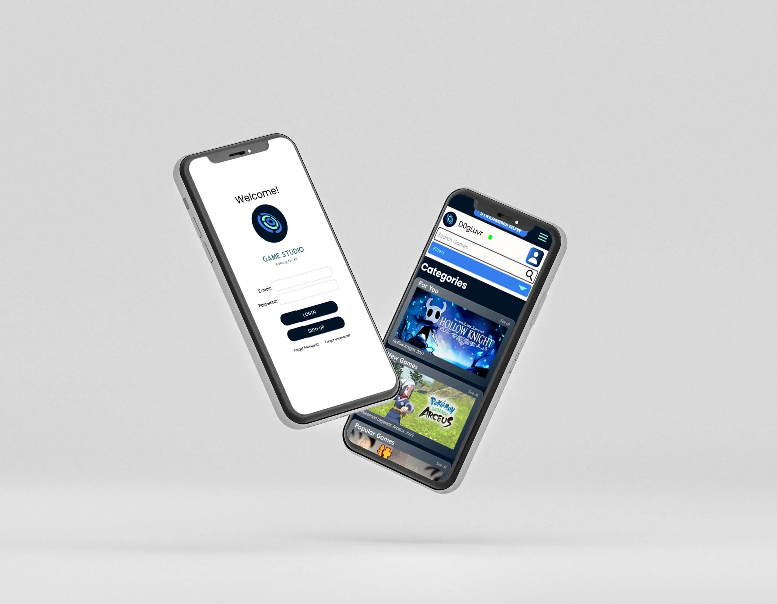
Concept Prototype

Mid-Fidelity Wireframes
Figma was the source for all the wireframins stages of this concept. In this mid-fidelity wireframes, we began adding our design systems and images that convey the appropriate message.
We implemented a search feature with filters and began ideating the look of those pages while creating components.
User Flow: https://whimsical.com/XKLZYKT9DXcM1zDx2hPQfB
Testing the concept prototype allowed us to see that certain links and buttons were a little difficult to click so we made adjustments.
Components
Components are the base of every application. Making functional components with variants and auto-layout helped us with responsive screens and a cohesive design.

User Testing
We came up with a testing plan in order to interview real video game users and get their feedback after each iteration of our design.
In each round of interviews, we chose 5 people to navigate through our pages and describe their thoughts, feelings, frustrations, and other reactions that could help us determine if our app was successful.
See the list of questions in our Usability Plan Template Testing 1 and Usability Plan Template Testing 2 documents.
Testing Round 1
We began by recruiting friends and family to test our first prototype version. We did virtual meetings with screen share to explore the trends, patterns, and other behaviors that users were to experience within our prototype.
After gathering the qualitative data, we made specific changes in response to the feedback that was provided by our users and peers. During this interview, we sent the user on a journey and took notes while highlighting the following:
User Wants
Needs
Goals
Pain Points
Testing Round 2- A/B Testing
We did A/B testing during the second iteration designs to determine which small differences would make the largest impact and we found the following information:
Between slightly different variations of the user interfaces, it was evident that the users did not like the overlay of Prototype A within the "Category” cards. The names underneath in Prototype B were more effective in conveying the appropriate message.

View Prototype A & Prototype B
Users from both Prototypes stated that the Game Voting sequence was a challenge in a visual and usability aspects. The checkboxes were hard to see, and everyone wanted to select the game by clicking the image itself and not just the text box.
We found that in both prototypes, users found memorable icons such as the record button, the green online button, the notification button, and the back button.
All users wanted more categories and genres than the ones we were featuring. They also wanted accessibility to friends’ gaming/ streaming information.

Usability Prototype

High level analysis: Trends and Patterns
Users asked for more friend information, whether it be streaming or preferred games
Implement more categories; the for-you category later received good comments
More ways to interact with other users was a general concern
Users consistently asked for better iconography, but the icons in-question were inconstant
Buttons were large but not too much so
“Simple, easy to use”
Spelling out subheadings is more user-friendly
Selection/voting options should always cover entire selection, not just a box
Reflection
Mobile gaming market is easy to find testers
Mobile gaming market is huge but unregulated
Gaming Studio brings together many user concerns
Gaming Studio could function as a sort of system software the likes of PlayStation network
Mobile app was very familiar to users
Symbols used are familiar, but not always at the front of the mind
High contrast helps with less visually-capable users
Blue and white/black theme is aesthetically pleasing
Further Research
Further Design
More communication functions for the user
With game developers and support teams
With app support
With other users
Implement video features for streaming flow
More interviews
Users think more outside the box when we come back to them, rather than with the first interview
More competitor research
More game development research
More streaming research