Impact
Three self-initiated audits across 4 platforms: website, online menu, mobile app and staff portal. After my reviews, the live site changed to match several recommendations, including 6 of 8 hidden brands made findable.
| My role | Floor lead; UX audits on my own initiative |
| Methods | Nielsen's 10 heuristics · WCAG contrast checks · task walkthroughs · cross-device review |
| Platforms | Website · online menu · iOS + Android app · staff portal |
| Timeline | Sep 2025 – Apr 2026 |
The spark
On the floor, I watch customers use our website and app every day. When a customer couldn't find a product online that we had in stock, I wondered: what else is hidden? So I started auditing.
1. Website and staff portal (Sep 2025)
A heuristic evaluation against Nielsen's 10 heuristics, with WCAG contrast checks on web, tablet and mobile.
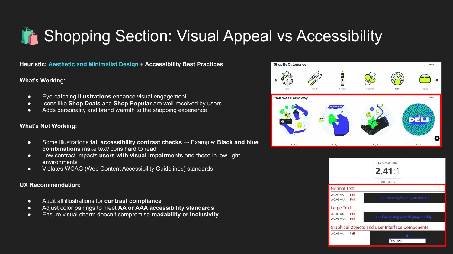
- Low-contrast banners: one measured 2.41:1, failing WCAG AA
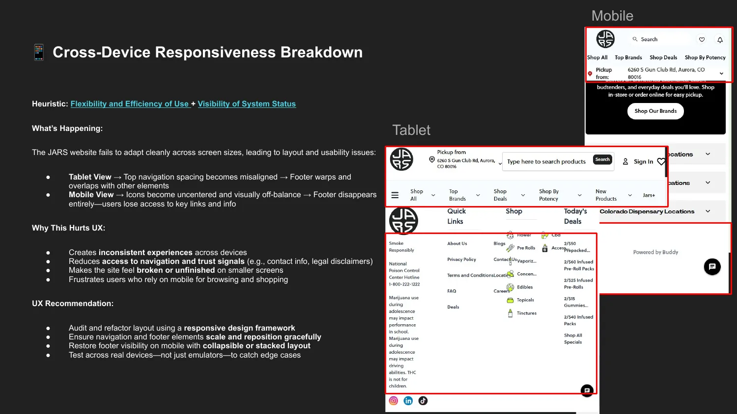
- Footer disappears on mobile; it warps on tablet
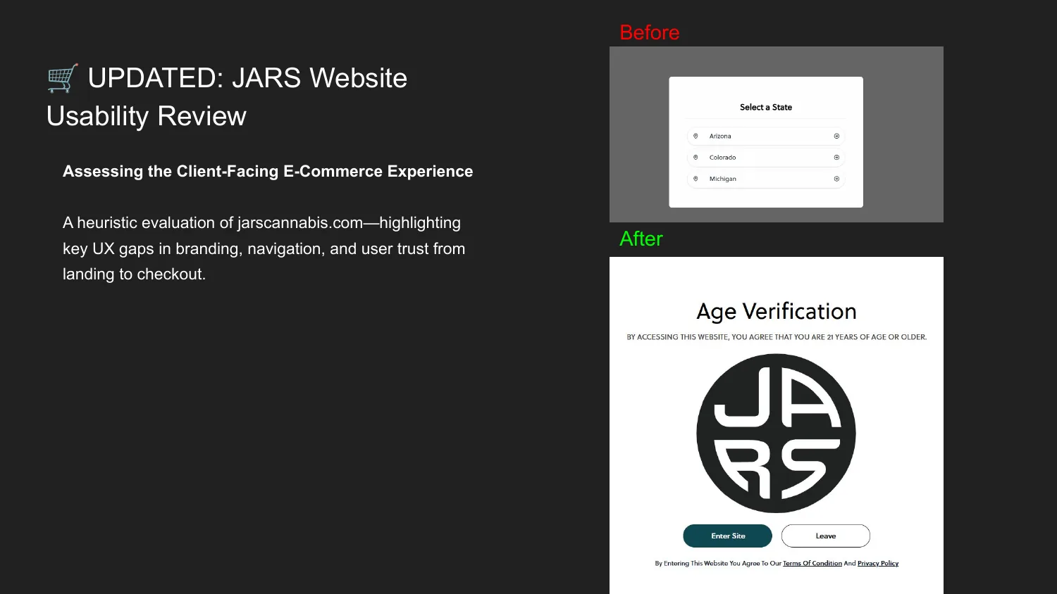
- Bare state-selection screen: no logo, navigation or explanation
- Staff clock-in: 6 steps, with a path to 4
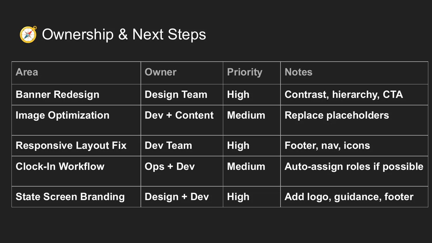
I closed with a priority table for leadership: 3 High, 2 Medium, each with an owner team.
2. Online menu (Dec 2025)
A task walkthrough that retraced the customer's search.
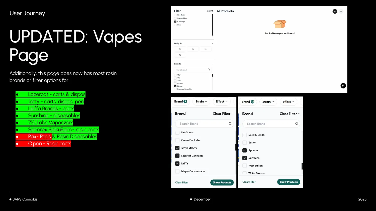
- 8 brands missing from the Brands filter, though they had brand pages
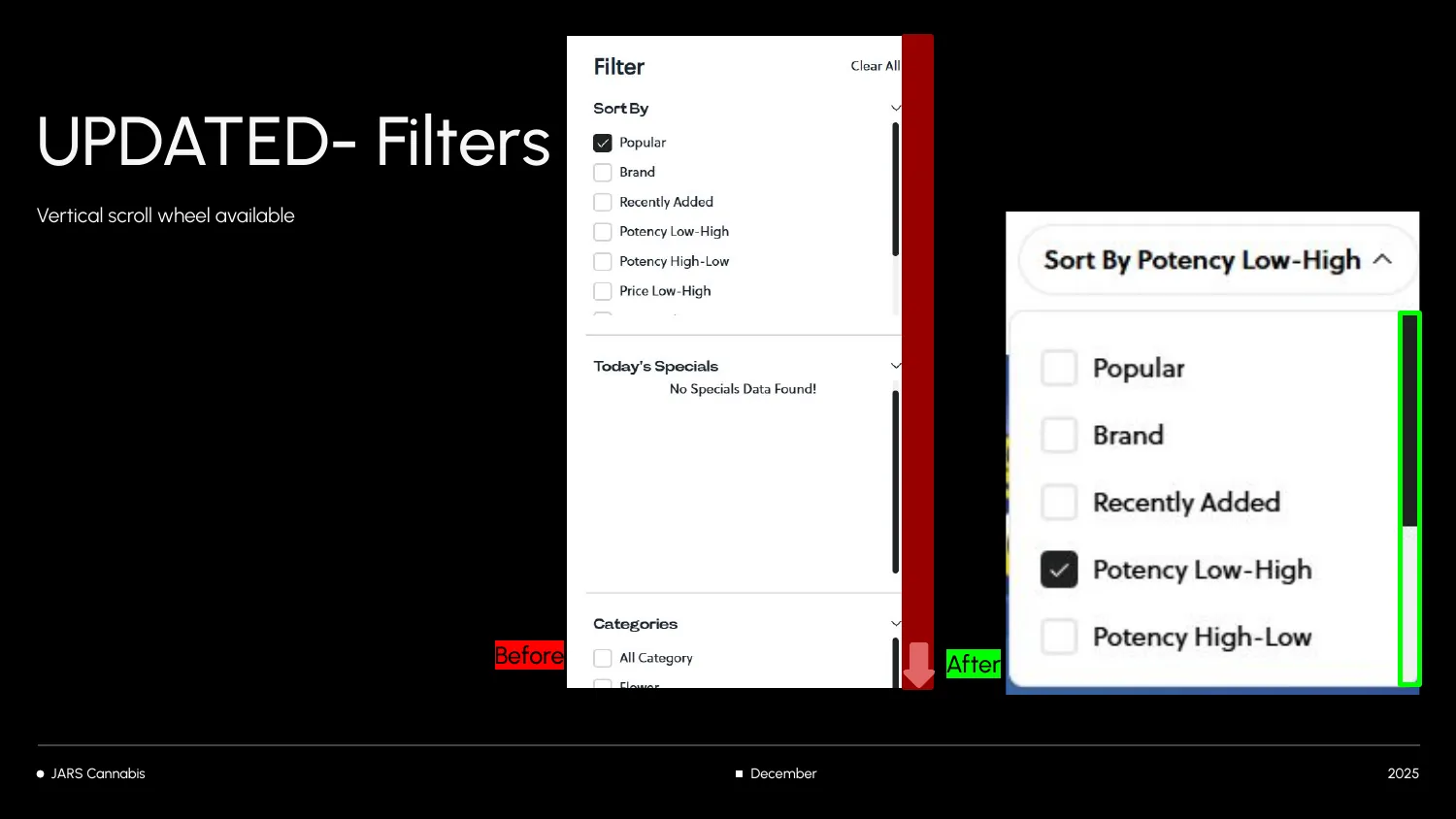
- Sort By used checkboxes for a single choice; it should use radio buttons
- No visible scrollbar, so shoppers couldn't tell more filters existed
- A new store still said "Coming Soon" after it opened
My re-check showed 6 of 8 brands now findable, a visible scrollbar and the correct store status.
3. Mobile app (Apr 2026)
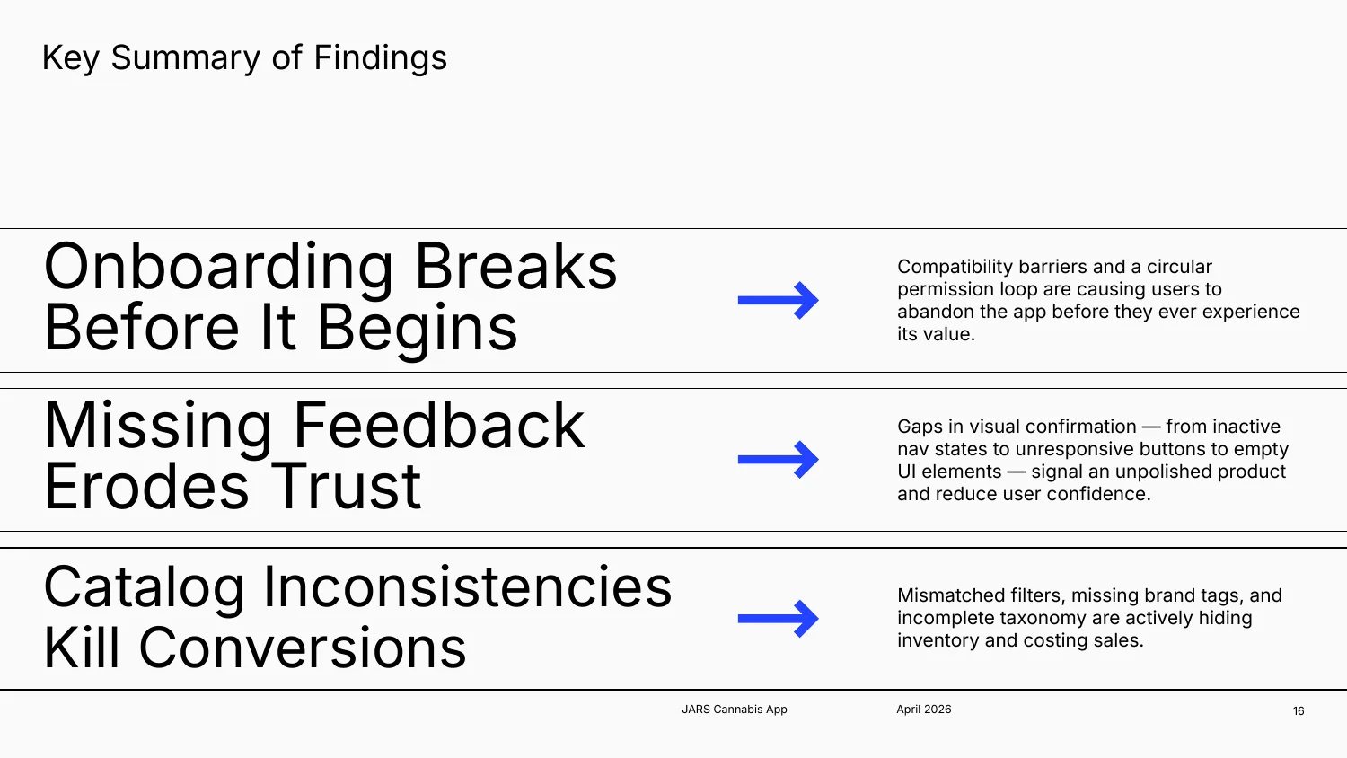
10 findings on iOS and Android, each written as Problem → Solution, grouped into three themes:
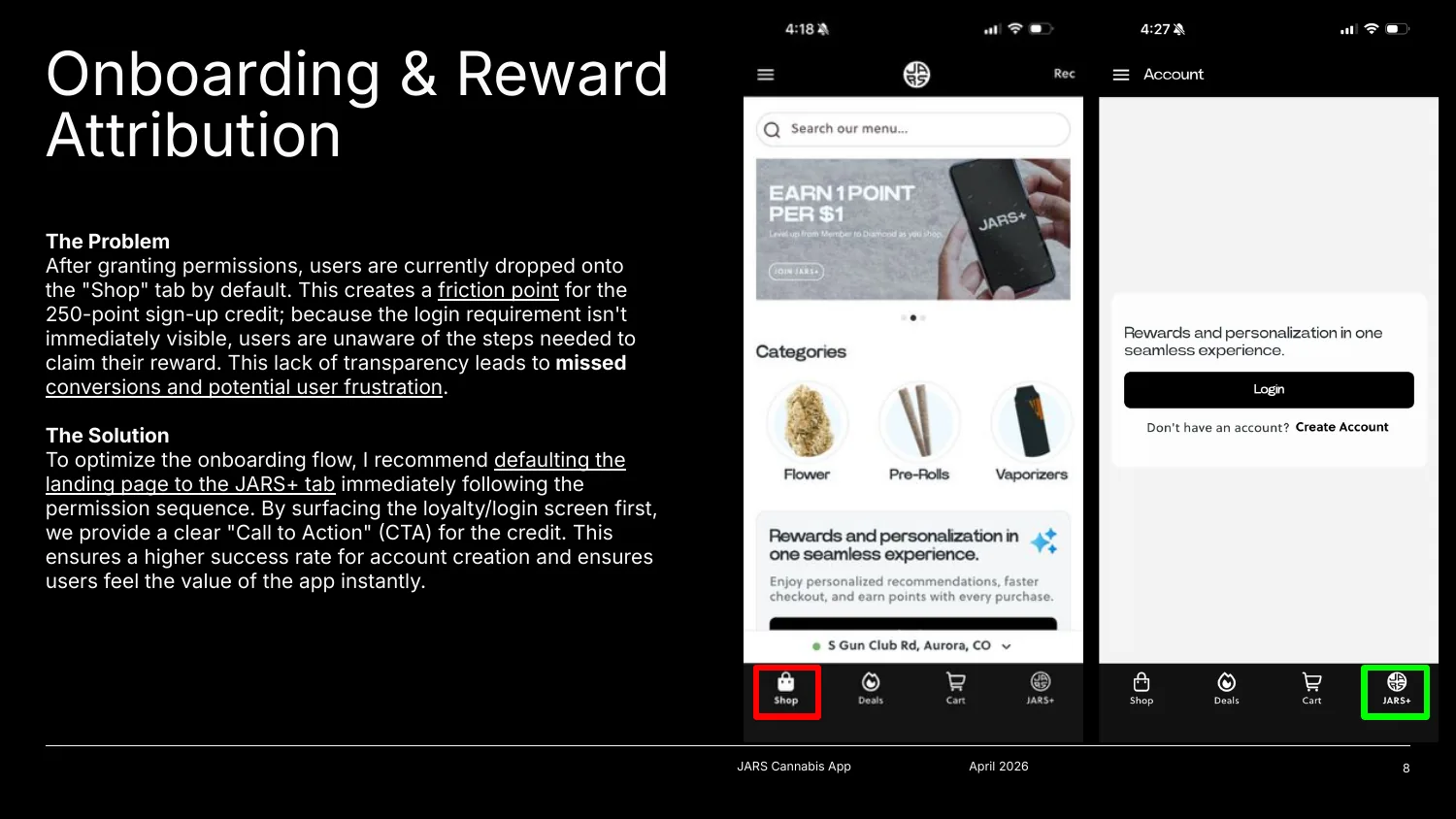
- Onboarding breaks before it begins: an age-permission loop, and a 250-point sign-up reward hidden on the wrong tab
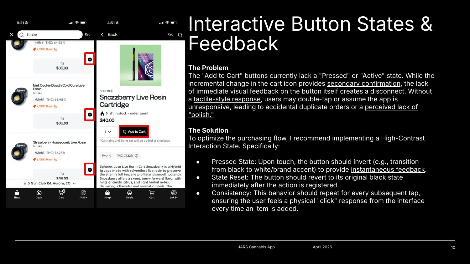
- Missing feedback erodes trust: no pressed state on Add to Cart, which invites double orders
- Catalog inconsistencies kill conversions: filters and tags that hide items in stock
What I learned
- Real-world use finds real problems. Jars launched its website and app without an in-house UX designer. Frustrated customers showed us what was broken: features that didn't work, and online inventory that didn't match the store.
- User testing is crucial. It shows how a product actually works for people, surfaces their pain points and leads to the right solutions.
- Speak the business's language. Framing each issue around trust and conversion, with a priority and an owner team, made it easier to act on.
- Next time: partner from the start. I'd agree on scope with the digital team first, so my findings feed straight into their roadmap.